restaurant branding
Graphic design & visual design, packaging Design
Objectives:
Develop a brand identity and logoCreate a suite of marketing materialsDesign and mock up custom packaging
Concept & IDeation
When starting this personal project, I saw it as an opportunity to apply and push the skills I’d developed through professional experience. I set out to create a full restaurant brand from the ground up - combining research and design strategy.
I knew I wanted to center the project around the restaurant, given the wide range of branding opportunities it would present. Logos, menus, signage, marketing materials, packaging - all would be available for me to exercise with. To add a layer of challenge, I chose a less conventional concept that I had relatively little experience with: a viking-theme burger restaurant. I landed on the name ‘ Bjorger Longhouse’ - a pun that made me laugh and quickly became the foundation from which I would build the brand.
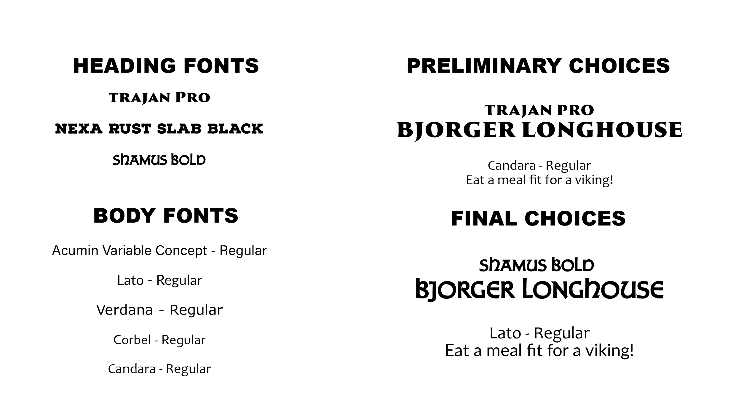
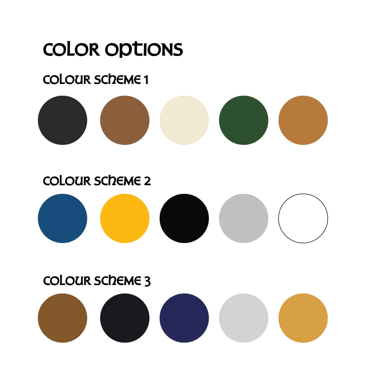
With the concept set, I turned to defining the brand’s visual identity. I began exploring typefaces that balanced bold personality with legibility. Early iteration leaned more into stylization, but I would ultimately decide on emphasizing legibility in the secondary text while maintaining stylization in the primary text. For color, I explored three directions: nature-inspired tones, viking-era metalwork tones, and a hybrid of the two; I settled on the latter to ground the brand in both tradition and modern appeal.
The fonts and colours would explore and settle on.
Logo Design
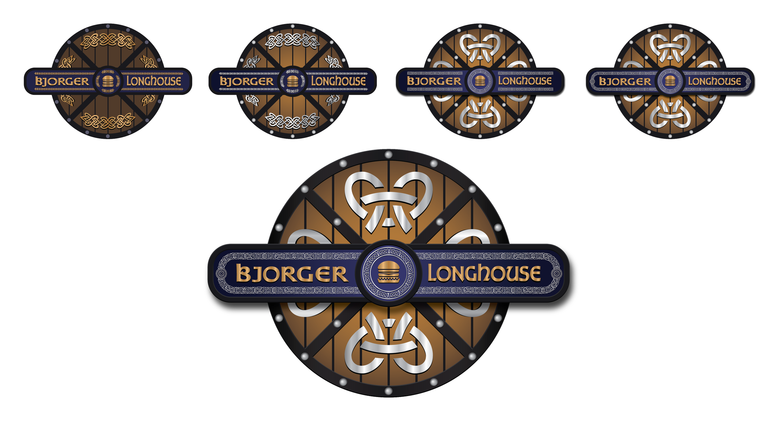
I explored two primary logo directions: one based on a wicking longhouse and another centered around classic Norse iconography - shields and axes. As the designs evolved, the shield concept stood out for its simplicity, strong silhouette, and symbolic potential. I refined this approach, eventually removing the axes to simplify the composition and improve visual balance.
The final logo features a stylized wooden shield circled by a metal band crossed in an ‘X’ shape. I added details through wooden planking and metal studs to better match its historical counterpart. A central plaque would be placed to house the restaurant name, supported by Norse-inspired runes and decorative motifs.
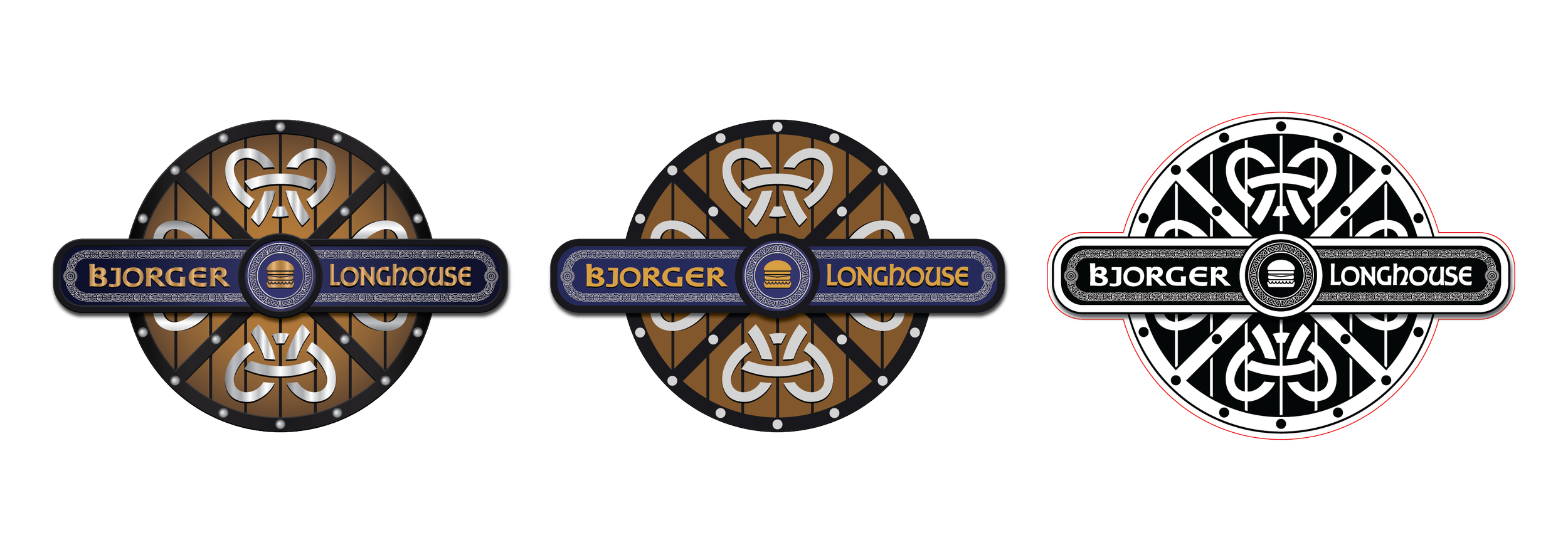
To enhance the depth, polish, and authenticity, I applied gradients and lighting effects - simulating raised metal and layered textures. The final logo system includes a full-colour version, a flat-colour version, and a monochrome variant, all to be used throughout the brand.
The progression of the logo and it’s final iterations.
Marketing Collateral & Signage
With the logo complete, I moved onto a range of collateral for the restaurant’s launch: menus, banners, and promotional flyers.
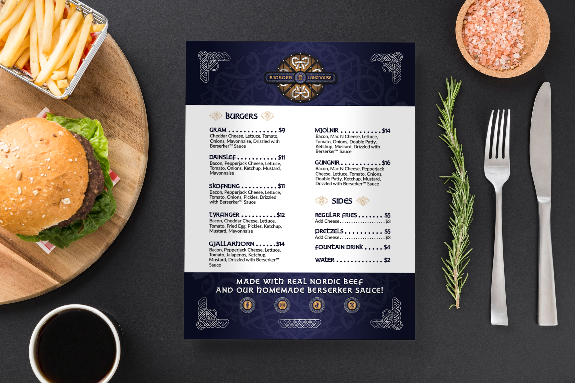
I would start with the menu. It was designed to reflect the brand’s personality while remaining easy to navigate. I used Norse mythological references - legendary weapons and artifacts - for item names, pairing them with unique, research-based recipes. A bold blue background emphasized brand consistency, layered with rune and mountain motifs for visual interest.
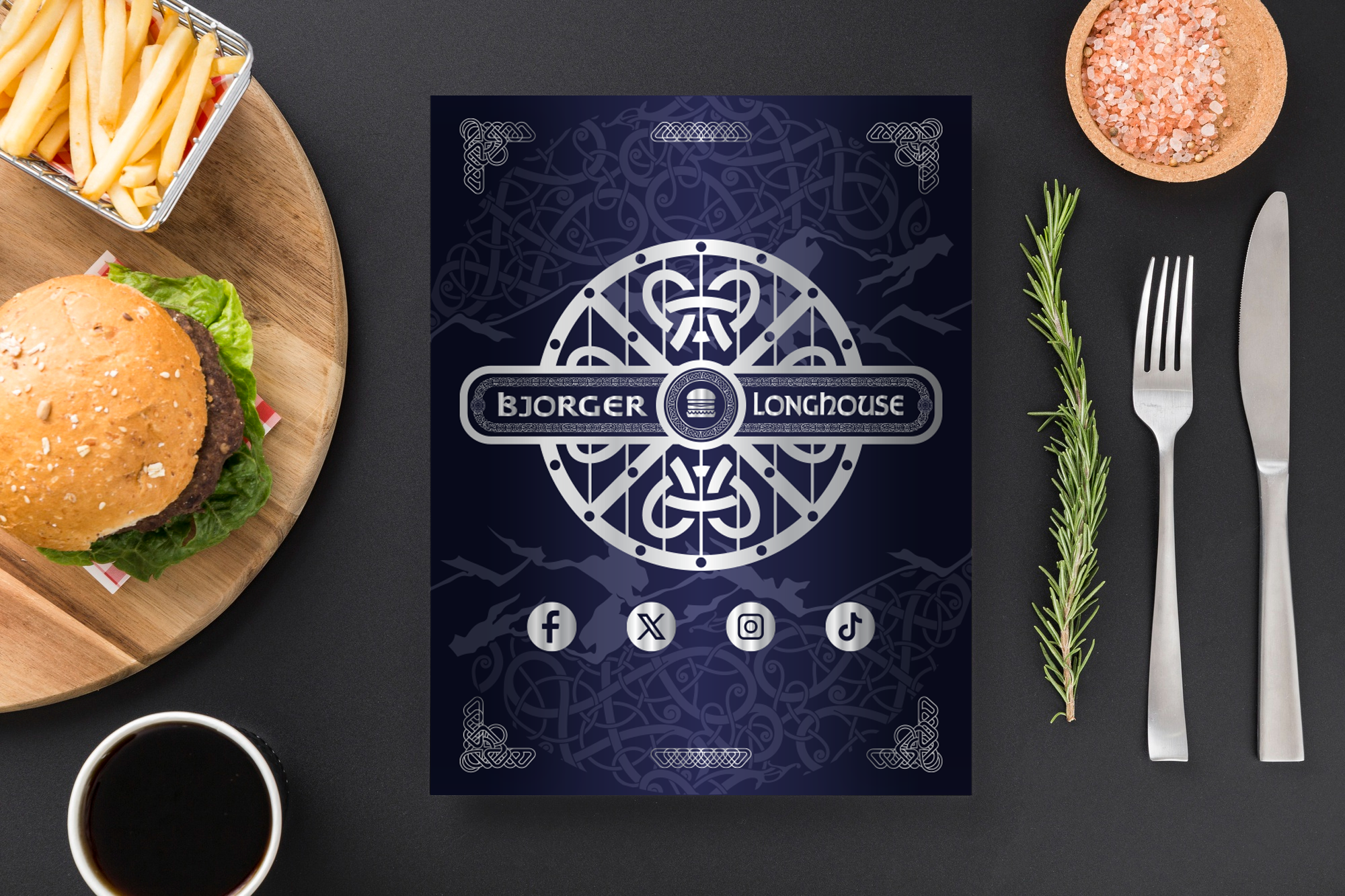
For readability, I placed content within white panels over the patterned background. The back of the menu would continue the blue theme, featuring a silver monochrome logo and social media icons to match. The overall layout balances theming with user-friendly design.
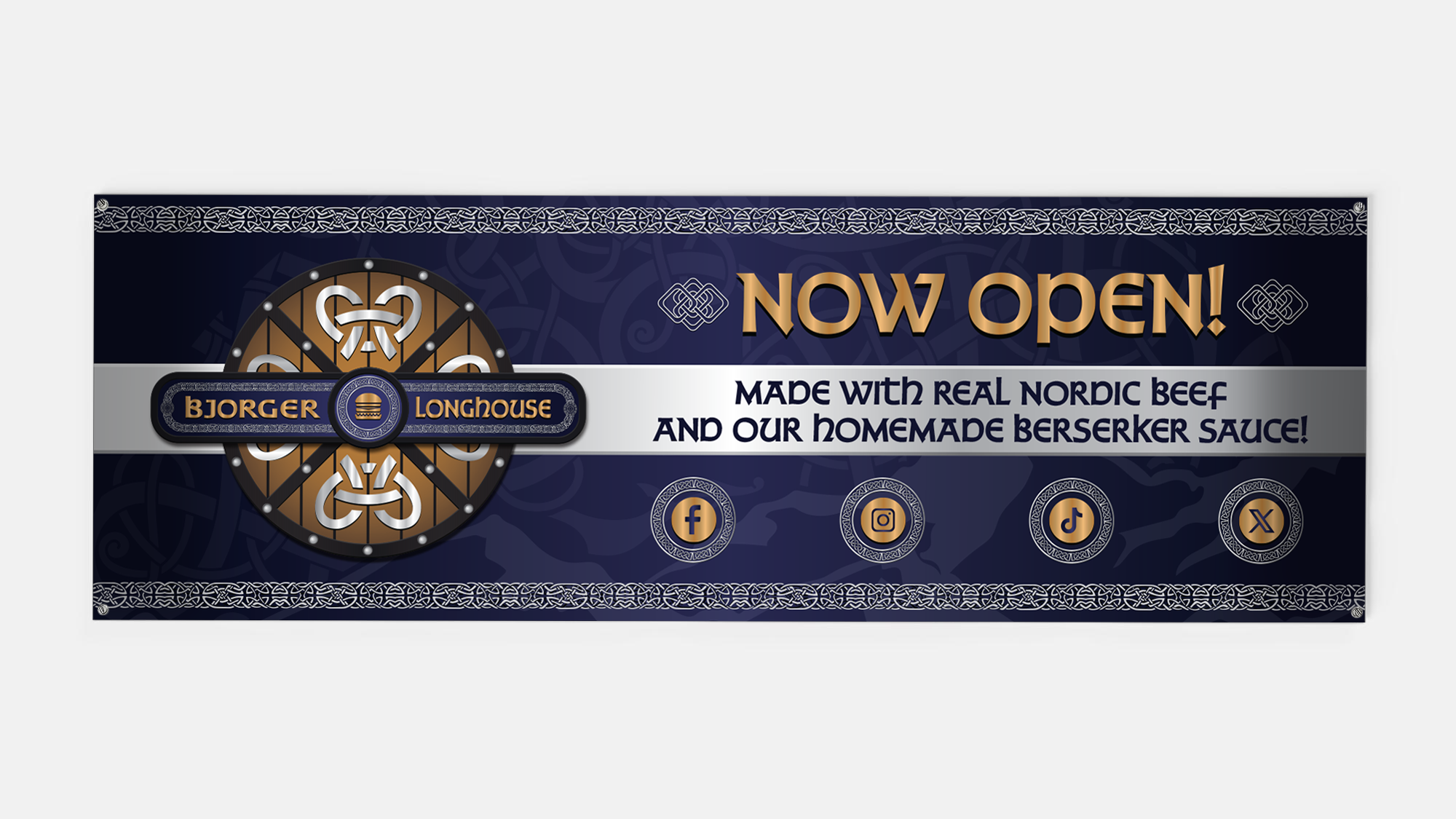
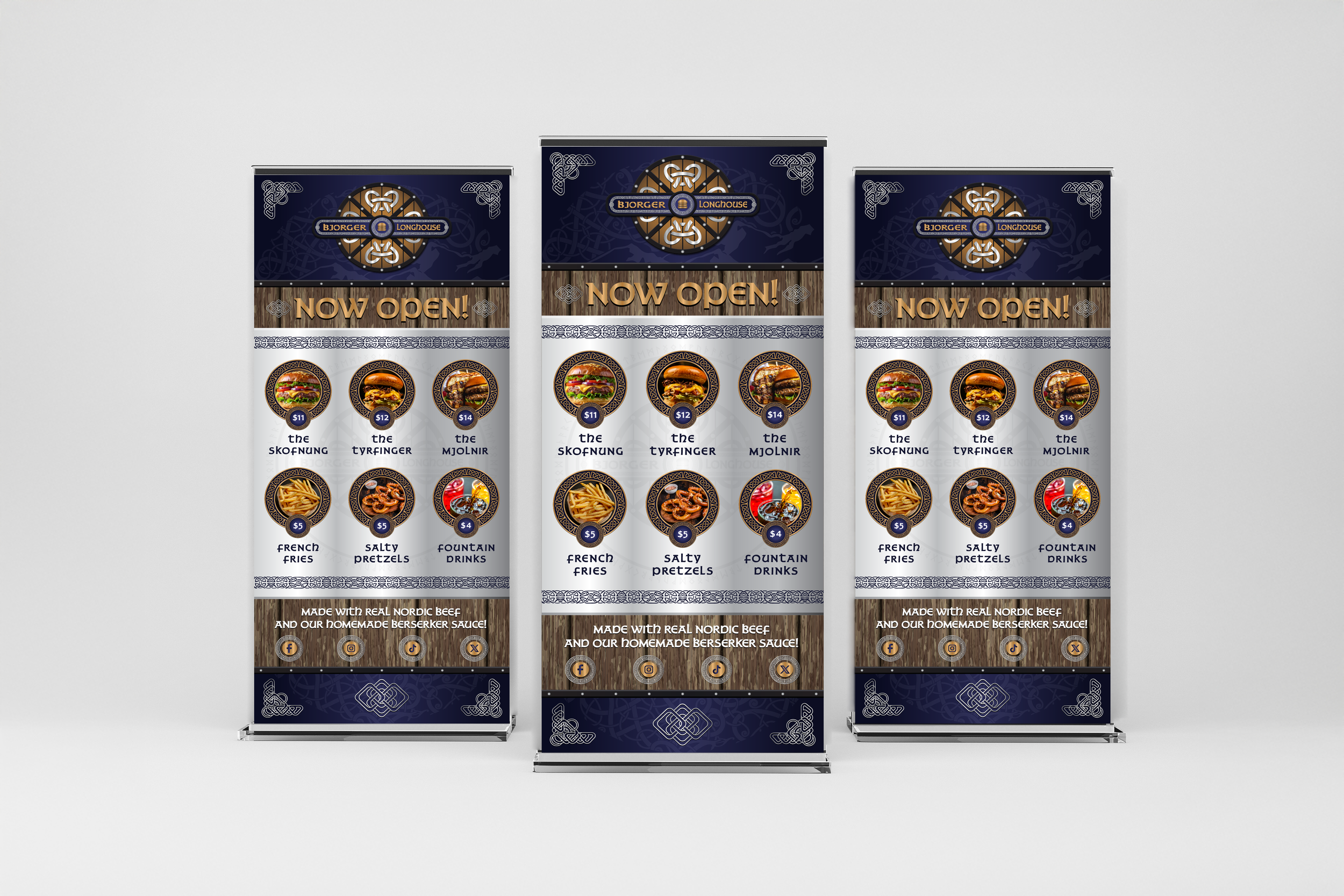
Next were the popup and vinyl banners. The vinyl banner was intended for exterior placement, taking a minimal approach: the logo, tagline, social handles and a simple “Now Open”. By contrast, the pop-up banner offers more detail - highlighting hero menu items and incorporating ornamental runes. I echoed the brand’s visual language by incorporating a wood-and-metal frame, referencing the logo’s construction and reinforcing the theme.
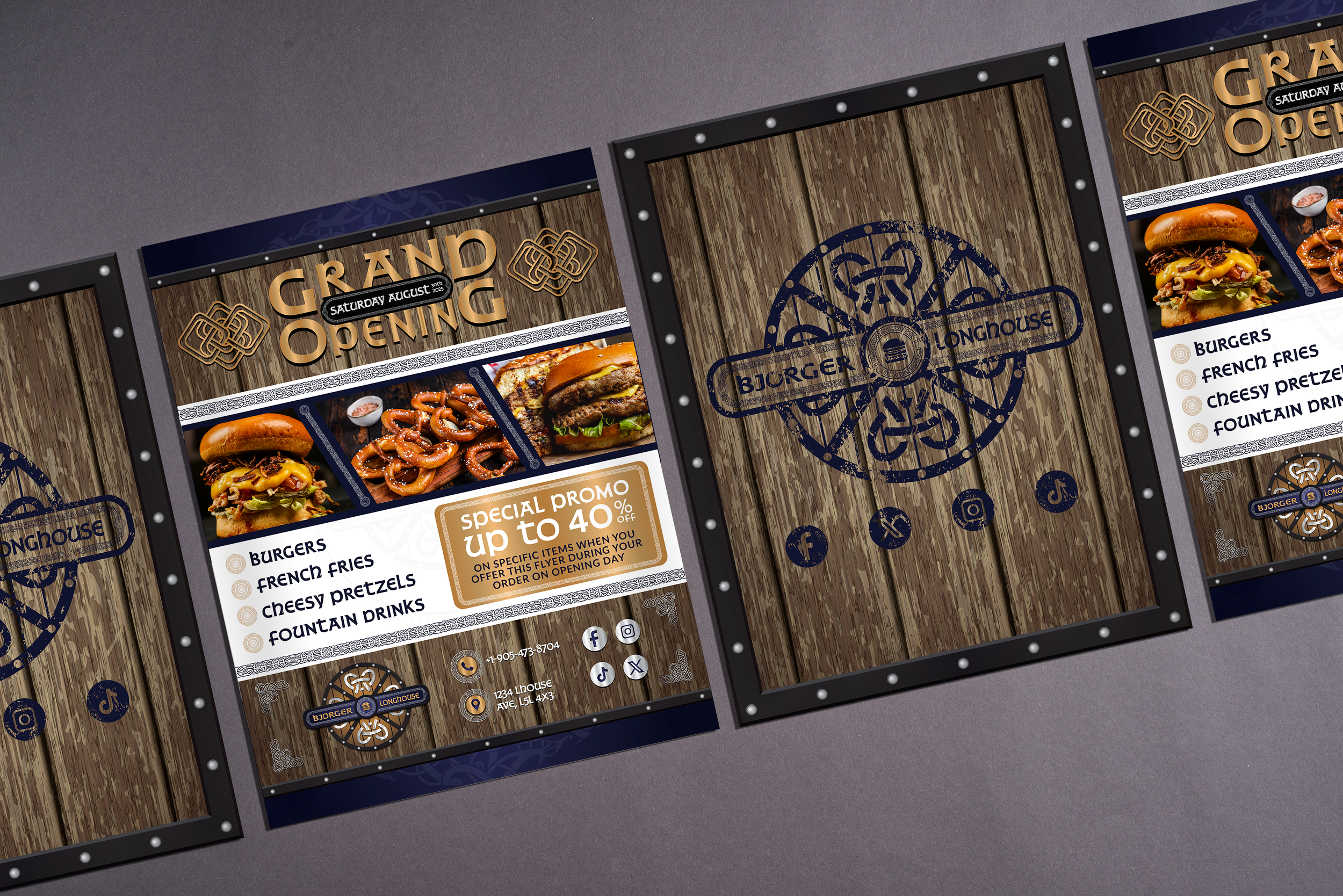
Finally, there was the flyer. The flyer served as both a launch announcement and discount voucher. The front showcase menu highlights, utilizing and adding upon the design elements that were established from both the menu and the signage. The back, however, introduces a new stylistic twist: a "worn paint” effect on the shield logo, added on top of the wood and metal contoured around the flyer, suggesting battle-worn signage. This added a fresh layer of storytelling while keeping within brand guidelines.
Packaging: Bottles & Boxes
Finally, I was to work on the designs for the delivery boxes and Berserker Sauce bottles. I started with the bottle.
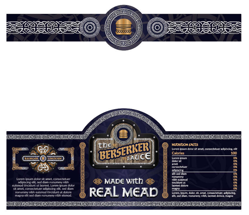
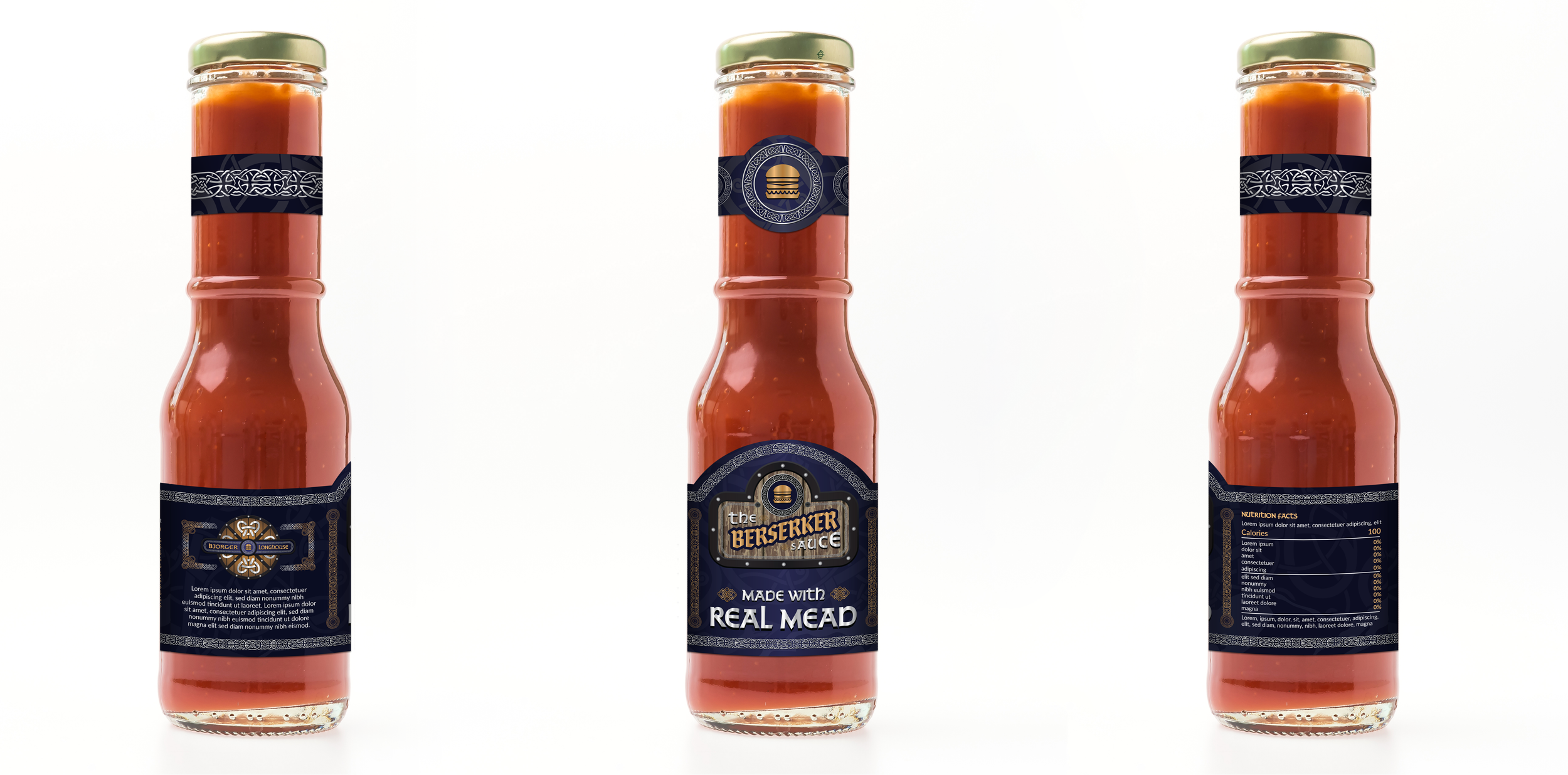
I designed a custom label for the restaurant's signature hot sauce. Drawing from real-world bottle dimensions, I divided the layout into three panels: the logos and origin story on the left, nutritional info on the right, and a central hero section featuring the product name on a faux-wooden sign and tagline. The label was then digitally mockup up in photoshop with light and curvature adjustments for realism.
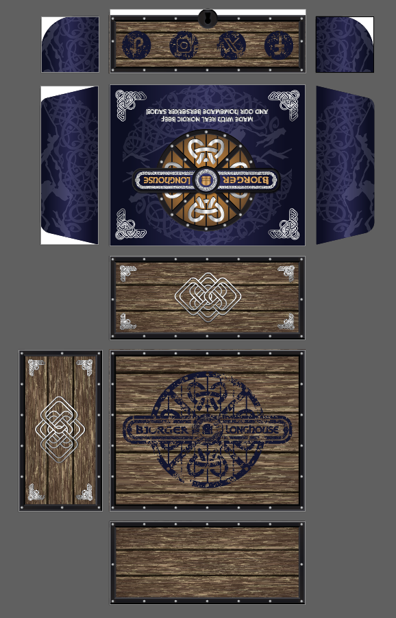
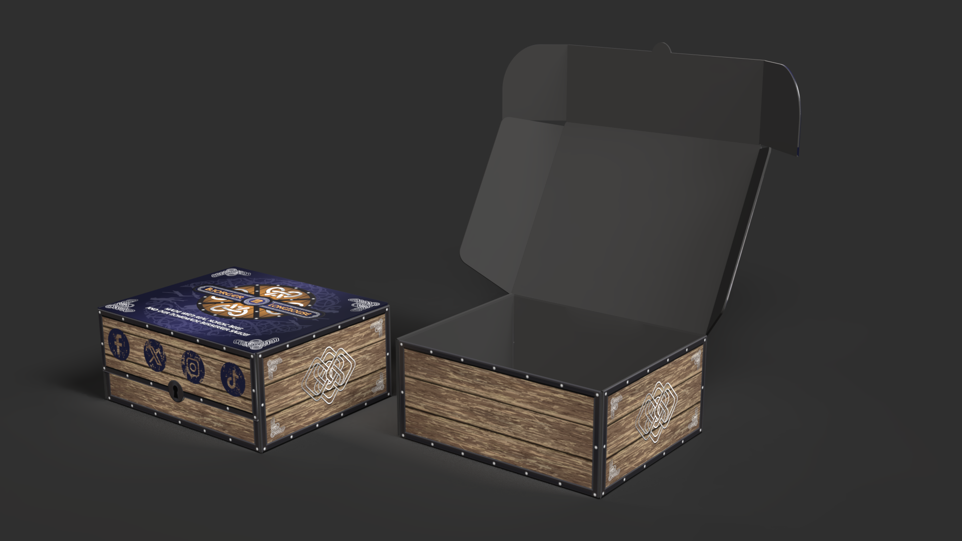
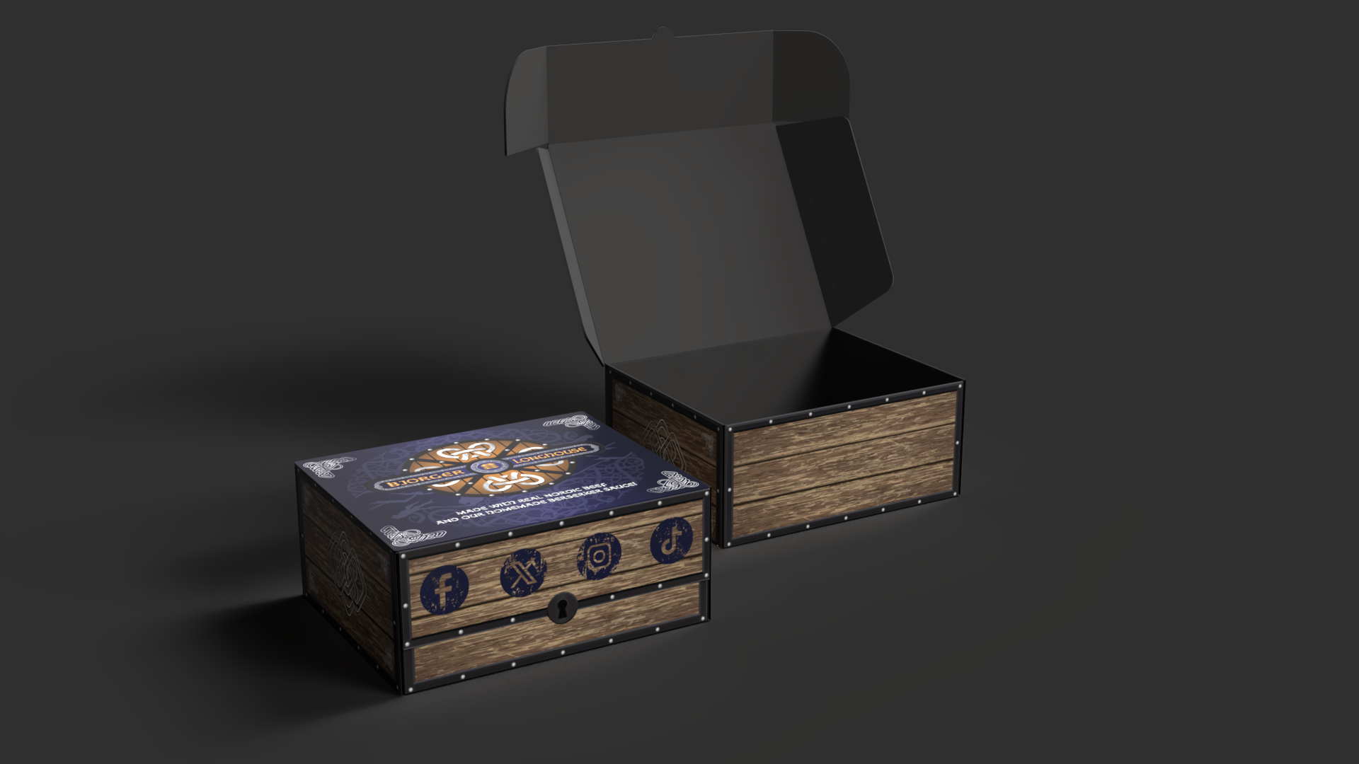
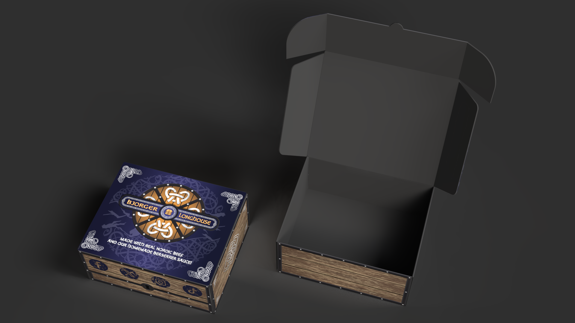
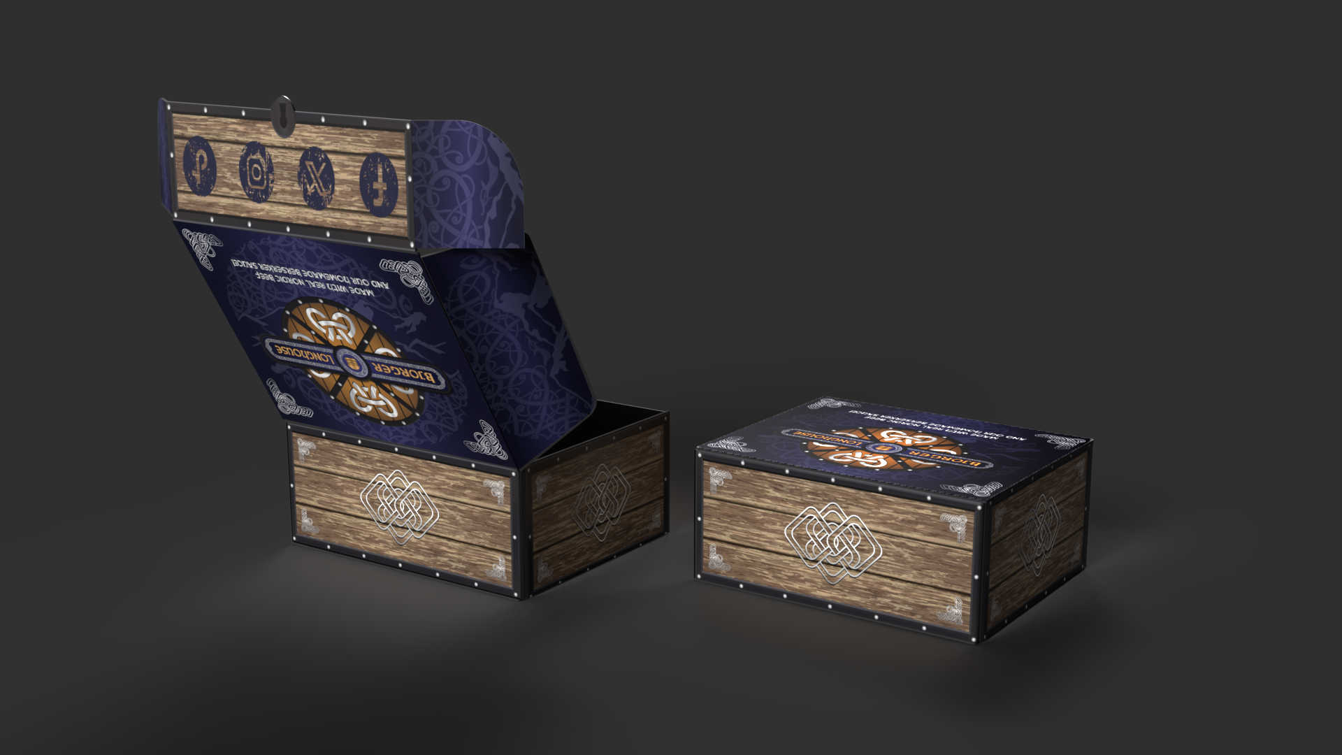
As for the delivery box, I wanted it to feel like part of the experience - not just packaging. Inspired by treasure chests, I designed a box with fau-wood planks, Norse runes, and reinforced metal corners. Social media icons and branding would be integrated in the design, and the lid featured the brand signature blue colour and rune-and-mountain pattern for visual continuity to the rest of the materials.
To visualize the packaging, I created 3D mockups using Illustrator (extruding flat surfaces and saving them as OBJ files) and Adobe Dimension (for staging and lighting). Two versions were rendered - closed and open - to showcase booth exterior design and internal layout. These mockups helped bring the full packaging concept to life.
This project was not only creatively fulfilling but also pushed me to explore new tools, techniques, and storytelling approaches. From logo development to 3D packaging renders, each phase offered its own set of challenges - and opportunities. I walked away with a stronger appreciation for immersive branding and a renewed sense of excitement for creative experimentation.

